Skills: UX/UI, Logo Design, Universal Design, XD, User Testing
Background: Swedes' annual consumption-based greenhouse gas emissions currently stand at around 9 tons per person, with household consumption contributing three-fifths of this total. To achieve the goal of reducing these emissions to 1 ton per person by 2030, reductions are needed not only within Sweden but also internationally. Avoiding overconsumption and choosing products with certifications such as Svanen or Bra miljöval can be steps in the right direction.
Issue: The multitude of third-party certifications today is challenging to navigate. While many know that certified products are usually better, it is rarely clear why. Additionally, these products are sold on various online platforms, forcing environmentally conscious consumers to search and compare across several places. This creates the need for a collective repository of certified products, making it easier for consumers to make sustainable choices.
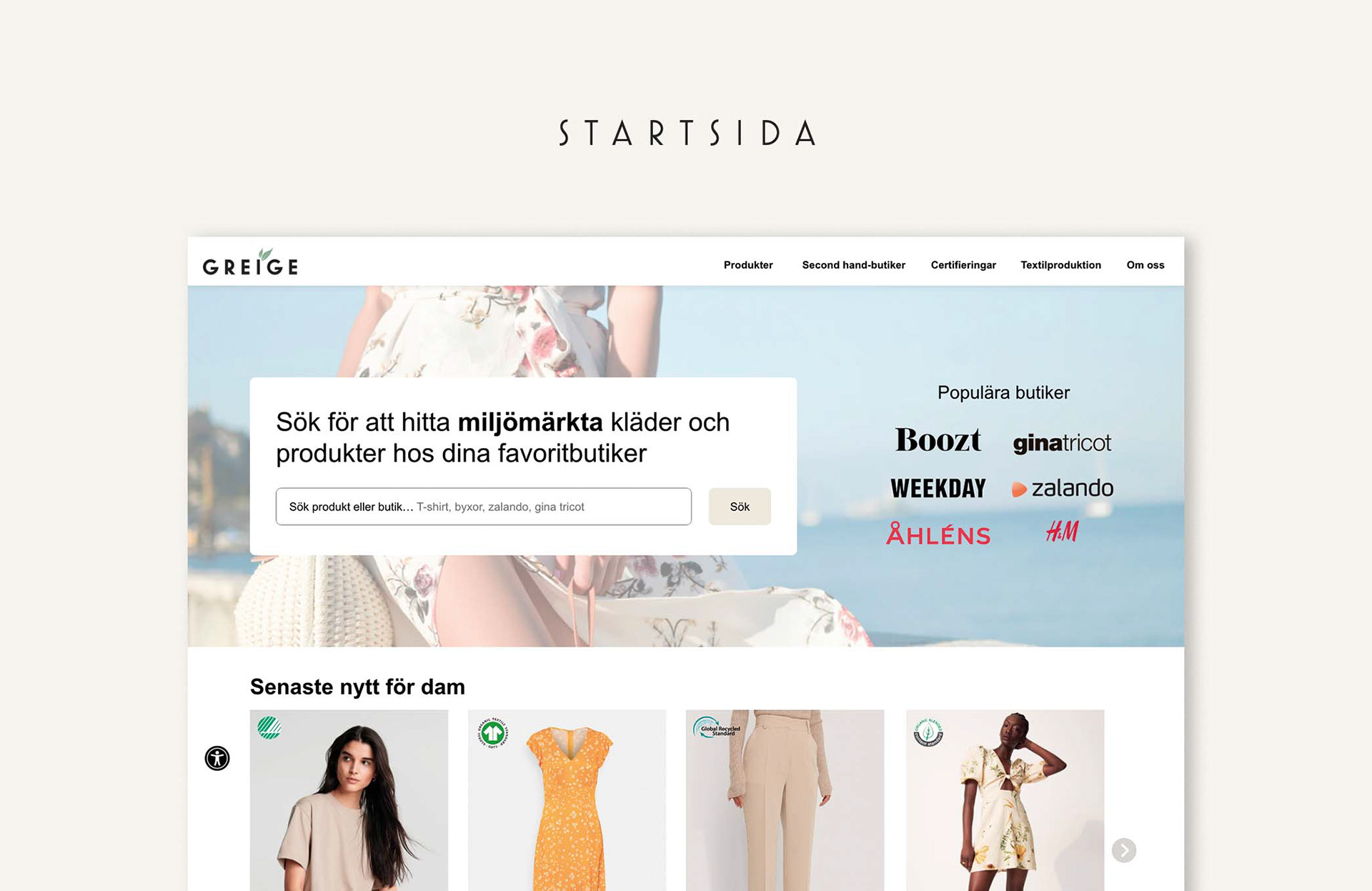
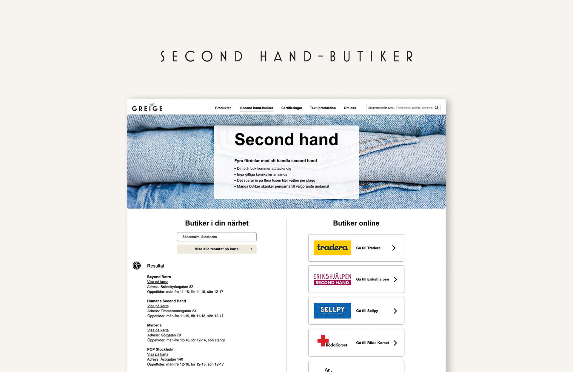
Solution: We designed the website Greige, the name inspired by the natural color of fabric before being treated with dye, beige and gray. Greige serves as both a collective repository for certified products online and an informative platform where individuals can learn about various certifications and materials. The website can also assist in finding second-hand stores. The goal of Greige is to facilitate sustainable shopping for consumers, simultaneously providing accessible information and educating about the importance of sustainable consumption.
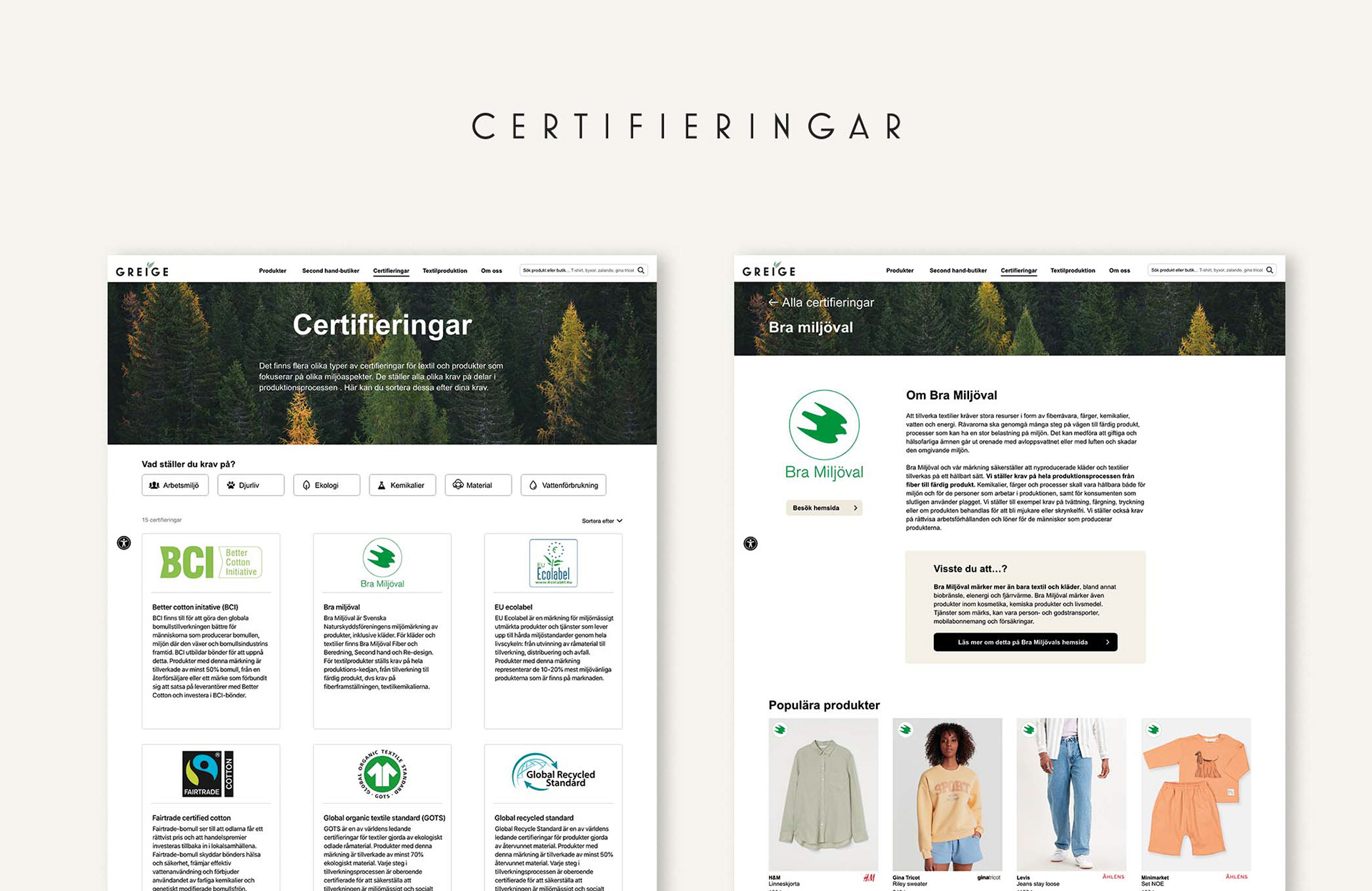
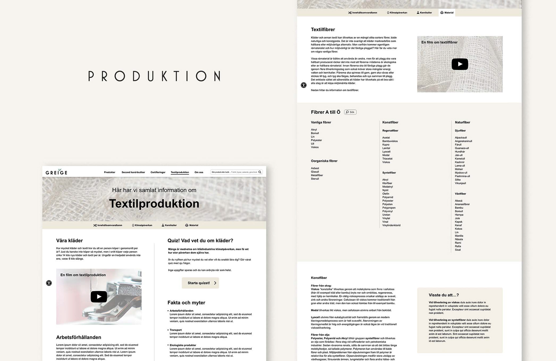
Certification Pages: As it is challenging for many to know which certifications impose specific requirements, we have implemented a filtering function where users can independently sort certifications based on their own preferences and priorities. In this way, we make it easier for users to access information that interests them.
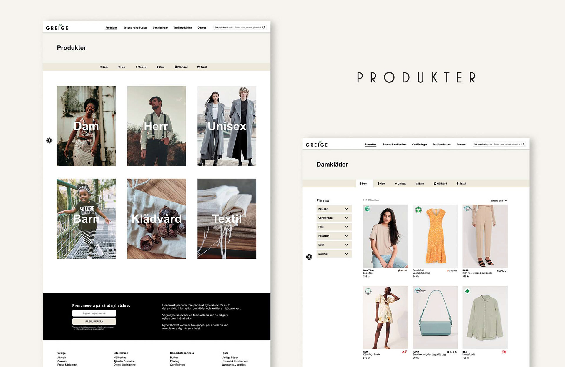
Product pages: In the filtering function, users can sort products based on specific characteristics as well as certifications. It is not possible to make purchases on Greige; instead, users are redirected to the original website of the product when clicking on an item of interest.
Strategies: User testing has been conducted throughout the process to continuously improve the user-friendliness of the website. The primary focus has been on accessibility and universal design, which led to the addition of an accessibility button that accompanies users during navigation. The idea is to open up the opportunity for users to customize language, contrast, font, font size, and more according to their needs.
Other important features to enhance accessibility include properly marked-up text elements (h, p, li, etc.), clear alt-texts, and keyboard navigation. Using Luminosity Colour Contrast Ratio analyses, we ensured that color contrast meets AAA or AA standards. We have also incorporated a variety of icons and symbols as complements to text headings.
Min role: Mia and I maintained regular communication about the website's design language and functionalities. My main areas of focus were developing the product pages and certification pages, where I also conducted research on the various certifications presented by Greige. I also worked on different alternative logos for Greige, and together, we decided to use the one shown in the prototype.
Test the prototype HERE